Overview
Welcome to the Shiny Genotyping Server
The DAPC Server is designed for the analysis of multilocus genotyping data, specifically micro/minisatellite data and Multilocus VNTR analysis (MLVA), on haploid microorganisms (bacteria and fungi)
Github
I recommand to download the code and use the application from github to avoid several server problems and for more feedback
https://github.com/Aucomte/ShinyGenotyping
Citations
the DAPC tab was adapted from the code written by the adegenet team. They have their own DAPC shiny application : https://github.com/thibautjombart/adegenet
Citation for adegenet:
Jombart T.(2008) adegenet: a R package for the multivariate analysis of genetic markers. Bioinformatics 24: 1403-1405. doi:10.1093/bioinformatics/btn129 [link to paper]
Jombart T. and Ahmed I. (2011) adegenet 1.3-1: new tools for the analysis of genome-wide SNP data. Bioinformatics. doi: 10.1093/bioinformatics/btr521
Citation for the DAPC:
Jombart T, Devillard S and Balloux F (2010) Discriminant analysis of principal components: a new method for the analysis of genetically structured populations. BMC Genetics 11:94. doi:10.1186/1471-2156-11-94 [link to paper]
http://adegenet.r-forge.r-project.org/Citation for poppr:
Kamvar ZN, Tabima JF, Grünwald NJ (2014). “ extit{Poppr}: an R package for genetic analysis of populations with clonal, partially clonal, and/or sexual reproduction.” PeerJ, 2, e281. ISSN 2167-8359, doi: 10.7717/peerj.281, https://doi.org/10.7717/peerj.281.
Kamvar ZN, Brooks JC, Grünwald NJ (2015). “Novel R tools for analysis of genome-wide population genetic data with emphasis on clonality.” Front. Genet., 6, 208. doi: 10.3389/fgene.2015.00208, https://doi.org/10.3389/fgene.2015.00208.
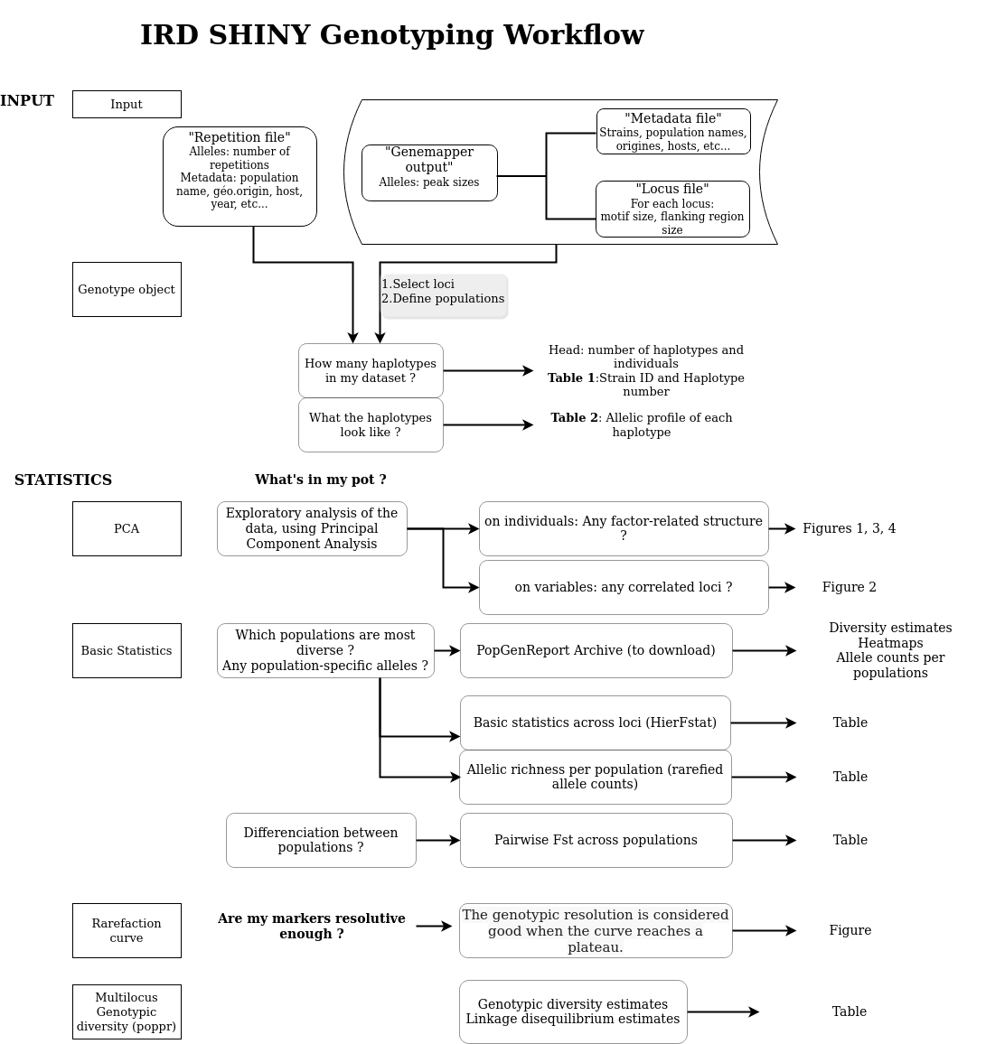
Input data
Genemapper table :
Metadata table :
repetition table :
Final Table :
(rdocumentation)
Before everithing select the loci and the population (ex: Country for the datatest) you want to work with, the his the button Submit. If you change the parameters, do not forget to hit sumbit again.
Table 1: Haplotypes and Strains.
Table 2: Allelic profiles of the haplotypes.
Statistics
Pairwise FST :
Basic statistics per locus (hierfstat) :
The number of alleles used for rarefaction :
Rarefied allele counts :
missing data by locus and by population:
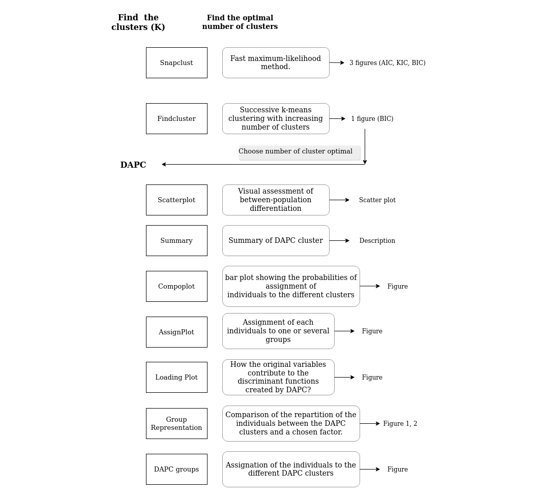
Find K : the number of clusters
- Snapclust is a fast maximum-likelihood method, combining the advantages of both model-based and geometric approaches (Beugin et al., 2018). The optimal number of clusters (k) are estimated using both the Akaike, Kullback and Bayesian Information Criterion (AIC, KIC, BIC, respectively). Ten runs of the Expectation-Maximisation (EM) algorithm are advised to estimate an accurate K and the probability of assignment (Q) of each individual into each of the k inferred.
- The function find.clusters runs successive k-means clustering with increasing number of clusters (k) and the optimal number of clusters is selected based on lowest Bayesian information criterion (BIC) (Jombart et al., 2010). 10 to 20 runs are advised to estimate an accurate K.
References:
Beugin, M.-P., Gayet, T., Pontier, D., Devillard, S. and Jombart, T. (2018) A fast likelihood solution to the genetic clustering problem. Methods in Ecology and Evolution, 9, 4. doi: 10.1111/2041-210X.12968.
Jombart, T., Devillard, S. and Balloux, F. (2010) Discriminant analysis of principal components: a new method for the analysis of genetically structured populations. BMC Genet., 11, 94. doi: 10.1186/1471-2156-11-94.
DAPC Analysis
Scatter Plot
The Scatter Plot page provides a visual assessment of between-population differentiation. Generated by applying the R function scatterplot to a dapc object, the output generated will appear in one of two forms. If only one DA is retained (always the case if there are only 2 groups), or both the x-axis and y-axis of the scatterplot are set to the same value, the output will display the densities of individuals on the given discriminant function. If more than one DA is retained and selected, the output will display individuals as dots and groups as inertia ellipses, and will represent the relative position of each along the two selected axes.
The number of axes retained in both the PCA and DA steps of DAPC will have an impact on the analysis and affect the scatter plot. By default, the number of DA axes retained is set at the maximum of (K - 1) axes, where K is the number of groups. The default value of the number of PCA axes is more arbitrarily defined, however, the 'Use suggested number of PCA components?' tickbox provides the user with the option to use cross-validation to identify and select an optimal number of PCs, where one exists. For more on this, see the section on cross-validation.
There are a wide variety of graphical parameters for the DAPC scatterplot that can be customised by the user. Those parameters that lack intuitive definition are described further in the Glossary.
Summary
This page provides a summary of the dapc object.
$n.dim' indicates the number of retained DAPC axes, which is affected by both the number of PCA axes and DA axes retained.
'$n.pop' indicates the number of groups or populations, which is defined by the dataset.
'$assign.prop' indicates the proportion of overall correct assignment
'$assign.per.pop' indicates the proportions of successful reassignment (based on the discriminant functions) of individuals to their original clusters. Large values indicate clear-cut clusters, while low values suggest admixed groups.
'$prior.grp.size' indicates prior group sizes.
'$post.grp.size' indicates posterior group sizes.
Compoplot
This page displays a compoplot, which is a bar plot showing the probabilities of assignment of individuals to the different clusters. Individuals are plotted along the x-axis and membership probabilities are plotted along the y-axis.From the compoplot, one can draw inferences about potential admixture, and about the way in which the selection of PCA axes affects the stability of membership probabilities.
Number of selected vs. unselected alleles
List of selected alleles
Names of selected alleles
Contributions of selected alleles to discriminant axis
Loading Plot
The Loading Plot page allows the user to examine how the original variables contribute to the discriminant functions created by DAPC. Variables are plotted along the x-axis, and the contribution of those variables to the DAPC is plotted in the y-axis.
The side panel on the Loading Plot page provides the option of selecting a threshold above which variables are identified. This can be useful simply for clarifying the image; hence, by default, only variables above the third quartile threshold are labelled. A drop-down menu contains a variety of clustering methods that can also be used to set this threshold. If desired, the user can choose to 'Select and describe features above the threshold'